Introduction
This lesson is the final component of the Biosignal Platform and of data-driven tests: Overview tab. In this tab, data from multiple respondents can be reviewed together to see how a group reacted, adding insight and scientific validity compared to single respondents. It explains how to view normalised or averaged physiological data, compare patterns across respondents, and write meta comments that describe what most viewers reacted to and where their reactions differed. This allows you to understand collective audience behaviour, to see which moments consistently triggered attention or arousal, which parts remained calm, and which scenes produced mixed or individual responses.
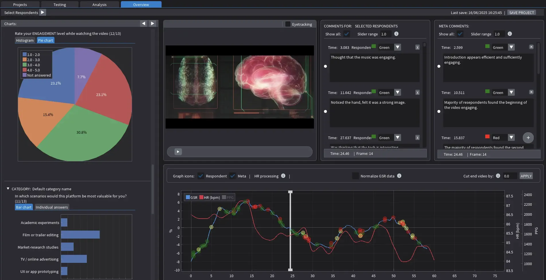
Overview Tab Layout
The Overview tab combines physiological results, questionnaire data, and collective annotations in one interface. It builds on the work completed in the Analysis tab but shifts focus from individual reactions to group trends. The layout contains several coordinated sections:
Respondent Selector (top bar):
Selects which sessions are included in the group analysis. When two or more respondents are active, their signals are automatically averaged or normalised to a shared scale. This allows overall engagement patterns to be compared directly.
Charts panel (left):
Displays summary graphs from questionnaire data. For example, engagement ratings appear as a pie chart, while responses to open questions or scenario prompts are displayed as bar charts. These charts provide a quick overview of how participants self-reported their experience after the test.
Video playback (centre):
Plays the tested clip in synchrony with all aggregated biosignal traces. The timeline can be scrubbed or paused for detailed inspection of specific segments.
Comments panels (right):
There are two comment sections. The first, Comments for Selected Respondents, displays the original annotations taken during the individual Analysis sessions. The second, Meta Comments, allows the creation of global observations about the group data. Both panels are time-synchronised with the video.
Signal graph (bottom):
Shows the normalised or averaged biosignal data for the selected respondents. The blue line represents group GSR, the red line shows group heart rate, and the optional yellow line is the averaged PPG waveform. Beneath the graph, controls allow enabling or disabling icons, normalising GSR data, or trimming the end of the video if needed.
Reading the Graph
The Overview graph visualises how the group responded over time. Normalised GSR and heart-rate traces reveal moments of shared reaction and provide a continuous picture of collective attention.
- GSR (blue line): Represents changes in skin conductance normalised across respondents. Peaks indicate moments when several viewers showed arousal at roughly the same time, suggesting shared attention or surprise.
- Heart Rate (red line): Represents the averaged cardiac response. Gradual rises suggest growing engagement or cognitive effort, while gradual declines indicate calm or recovery.
- PPG (yellow line): Serves only as a technical indicator of signal quality. It should not be interpreted.
When reading the graph, focus on timing and pattern rather than amplitude. High peaks do not mean stronger emotion; they show that several viewers reacted similarly. Broad rising or falling sections indicate the pacing of engagement across the sequence.
Working with Normalised and Averaged Data
Normalisation scales each participant’s data to a comparable range. This process removes differences in individual physiology so that responses can be interpreted on equal terms. Once normalised, data from all respondents contribute to a single group trace. The height of a peak shows the degree of synchrony, not the absolute intensity of the reaction.
Normalisation is a mathematical process that adjusts data from different participants so they can be compared directly, even if their raw values differ in scale or baseline. In physiological data, one person may naturally have higher skin conductance or a faster resting heart rate than another. Without correction, these individual differences would distort group averages.
To address this, each signal is transformed into a common numerical range, often between 0 and 1, or expressed as a z-score that shows how far each data point lies from that participant’s own mean. This procedure preserves the shape and timing of each participant’s response but removes absolute differences in magnitude.
For example, a GSR value of 5 µS from one participant and 10 µS from another might both represent the same relative rise in arousal if each is near the top of that person’s range. After normalisation, both would appear as values close to 1.0. Mathematically, this process ensures that every participant contributes equally to the group profile. It converts heterogeneous raw measurements into a comparable, dimensionless scale that represents relative change instead of absolute level.
The Meta Comments panel allows writing group-level notes during playback. These comments are time-coded and colour-coded automatically. They can summarise shared arousal points, calm periods, or sections where responses diverged.
For example, a meta comment might state that “Most respondents showed a rise in GSR during the reveal sequence” or “Engagement dropped across all respondents during dialogue.” When disagreement or inconsistent reactions appear, this can be noted as “Mixed response between 40 and 45 seconds.”
Meta comments are used later when preparing the final report or when presenting findings to creative teams. They distil the group’s physiological data into a small number of clear, interpretable observations.
Combining Signals and Questionnaires
The questionnaire charts on the left side of the Overview tab complement the physiological data. They show how respondents rated their engagement or described their viewing experience. These charts help validate whether physiological reactions align with self-reported impressions.
If most respondents rated engagement high and the GSR curve supports that pattern with regular peaks, it confirms sustained attention. If questionnaire data show high interest but the GSR trace remains flat, this might indicate quiet cognitive focus rather than excitement. Combining both types of evidence gives a balanced picture of audience response.
Practical Workflow
- Select the group of respondents to include using the top dropdown.
- Observe the aggregated GSR and HR curves while watching playback.
- Identify moments where responses overlap strongly across participants.
- Add meta comments describing these moments and their on-screen causes.
- Note any intervals with low or inconsistent responses.
- Use questionnaire charts to interpret why those patterns may have occurred.
Scientific Interpretation
GSR reflects short-term sympathetic activation and shows when the body reacts, not why. Heart rate shows the slower process of engagement and release over time. Both indicators represent physiological arousal, not emotion or preference. PPG remains a technical measure that verifies heart-rate accuracy and should not be interpreted. Normalisation and averaging enable comparison between respondents but do not measure emotional strength.
Summary and Final Notes
The Overview tab provides the final stage of analysis, transforming multiple individual results into a clear collective picture. It shows how a group of viewers responded to the same video, which moments attracted shared attention, and where reactions diverged. Meta comments record these findings in concise form, while questionnaire data provide context. Together, they allow the analyst to move from single-viewer observation to a full understanding of group-level engagement.
This lesson completes the Biosignal Platform: Interactive Walkthrough course. Across the modules, the workflow has progressed from software setup to analysis and interpretation, reflecting the complete process of a data-driven audience test.
Together, these steps form a coherent framework for applied audience research in creative and educational settings. The Cinematronic Biosignal Platform provides a scientifically grounded yet accessible method for exploring how viewers engage with film and media. As we already stated before, its purpose is not to replace artistic judgement but to enrich it with objective feedback, showing when the body reacts, how attention unfolds, and where storytelling captures or loses its audience.